

Overview / Oitchau
A more human way to manage the working day.
Designing Oitchau’s mobile and web experiences — from a trustworthy clock-in to a clearer view of the entire team.
The complete presentation · PDF · 31 pages
Fewer recognition errors for Black users
Facial recognition · page 12Company adoption in the first year
Facial recognition · page 12Time to value on the dashboard
Dashboard · page 31Results reported in the project presentation.
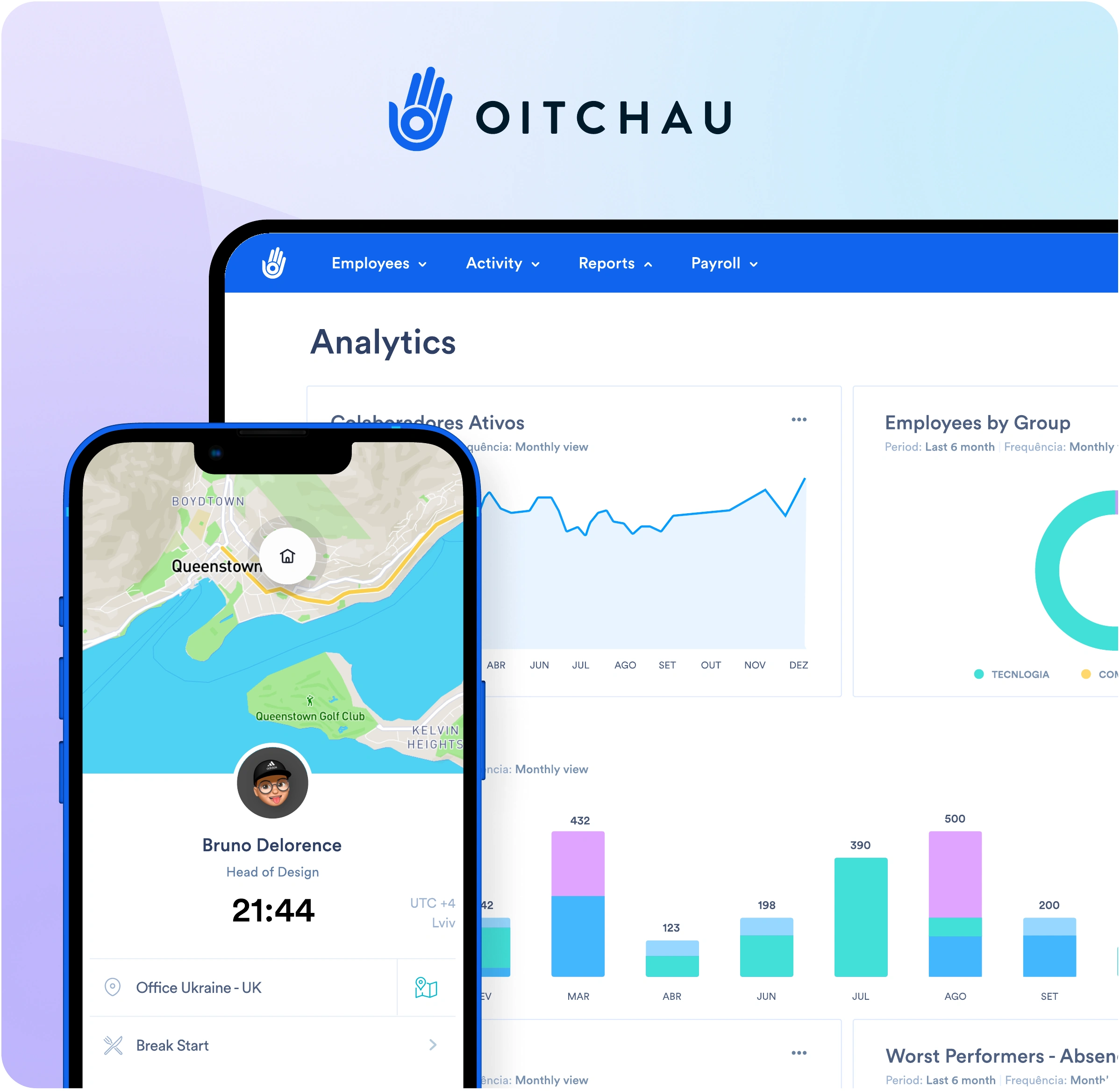
00 / The approach
A product process that stays close to people.
Oitchau brings time tracking, attendance, payroll workflows, and workforce visibility into one platform. Employees need a simple daily tool. Managers need reliable information to act on.
My work connected design, stakeholders, and engineering: defining the process from research to implementation, aligning business needs, and iterating through qualitative and quantitative feedback.
Understand
Planning, research, and information architecture. Start with customer needs and business priorities.
Make & validate
Explore wireframes, visual direction, and prototypes. Test with users and work with engineering through handoff.
Learn after launch
Monitor feedback and bugs. Review use over time and feed what we learn back into the product.
01 / Facial recognition
Trust at the very first touchpoint.
Colleagues clocking in for one another created a real problem for managers. Facial recognition could help — but only if it was fast, affordable, and reliable for the people using it.
The challenge
Security cannot come at the expense of usability.
65% of the managers interviewed reported time-clock fraud. The design challenge was to verify identity without adding friction to a routine employees repeat every day.
We researched biometric patterns, ran an MVP with 50 selected companies, and worked to bring authentication below two seconds.













What testing revealed
A working feature is not enough if it does not work for everyone.
Tests revealed higher false-negative rates for darker skin tones. The case recorded an 18% false-negative rate, making fairness a core part of the work.
The team expanded the training database, tested with more diverse groups, and established ongoing feedback to identify new failure cases.
In the interface, failed verification led to an approval request a supervisor could review, giving employees a way forward.










After implementation
Keep a human in the decision.
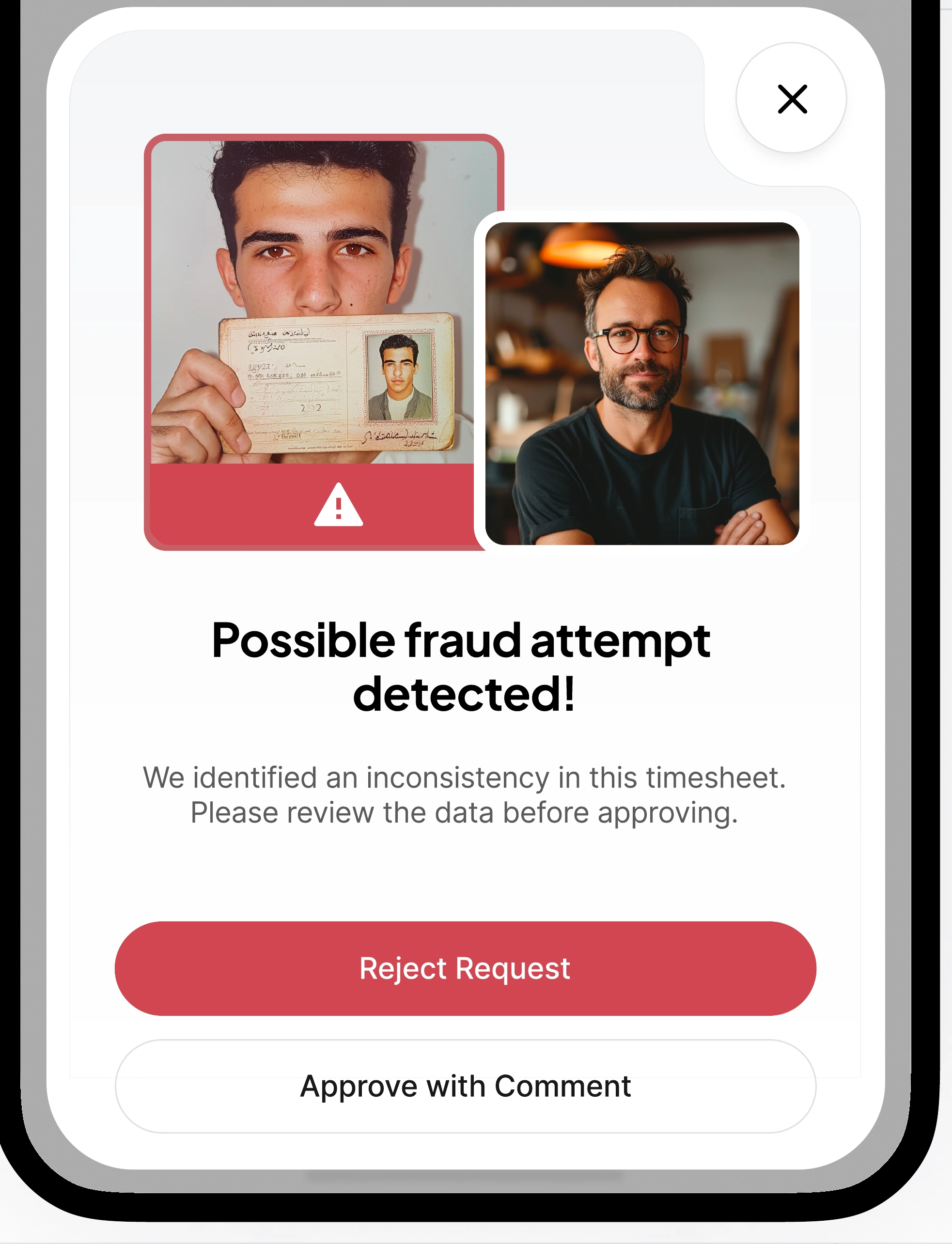
Potential fraud required a separate response from technical failure. Managers needed enough context to review a flagged request, reject it, or approve it with a comment.
The goal was to support a decision, with visible evidence and a traceable action.
The outcome
- 85%
- Fewer recognition errors for Black users
- 80%
- Of registered companies adopted the feature in its first year
- 30%
- Increase in employee satisfaction with usability
Outcomes reported in the project presentation, facial recognition chapter (page 12).
02 / The mobile experience
Less time managing time.
For employees, time tracking should fit around the working day. The mobile experience brought schedules, clock-ins, requests, and activity into a tool they could use wherever work happened.
A lesson about the audience
The person using it is not always the person buying it.
The early work focused on the employee clocking in. The presentation reflects on nearly two years without revenue before recognizing a crucial gap: the buyer's needs deserved the same attention.
The product had to serve both sides — a quick daily experience for employees and meaningful control over schedules, overtime, and approvals for managers.

The starting point
A daily routine with unnecessary friction.
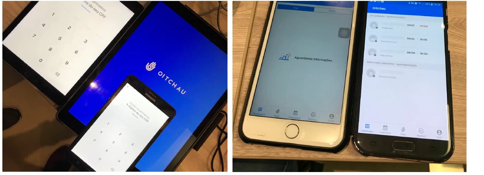
Physical time clocks and fragmented records created queues and made it difficult for employees to understand their hours. Managers lacked a clear view of what was happening.
The design direction
Make the next action obvious.
We brought the schedule, current status, and clock-in action together, then explored how requests and activity details could follow the same clear interaction patterns.
From structure to interface
Make the workflow clear before adding the detail.
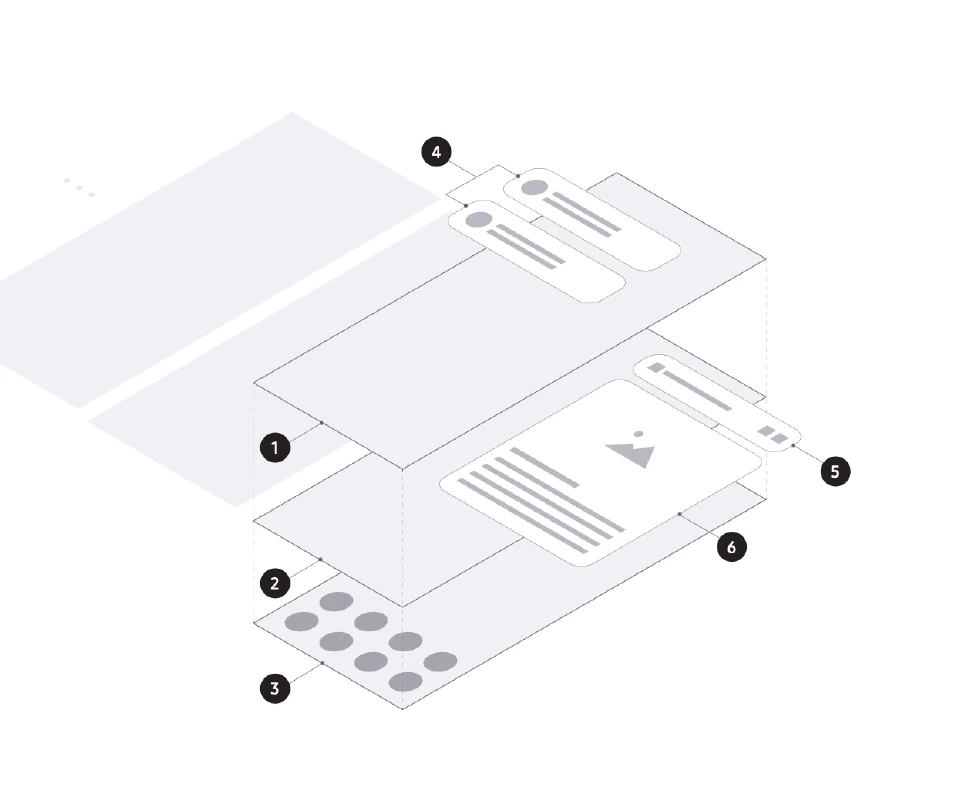
Wireframes connected the key tasks and established the hierarchy. Interface iterations then developed the visual language and reusable patterns across the product.
The solution
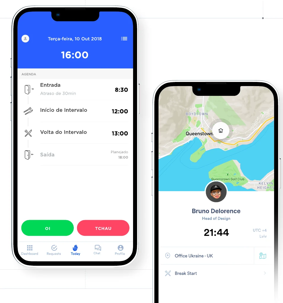
The working day, at a glance.
Two primary actions — “Oi” to clock in and “Tchau” to clock out — simplified the main flow. Distinct labels and contrasting colors made each action recognizable, while the daily agenda showed progress through the working day.
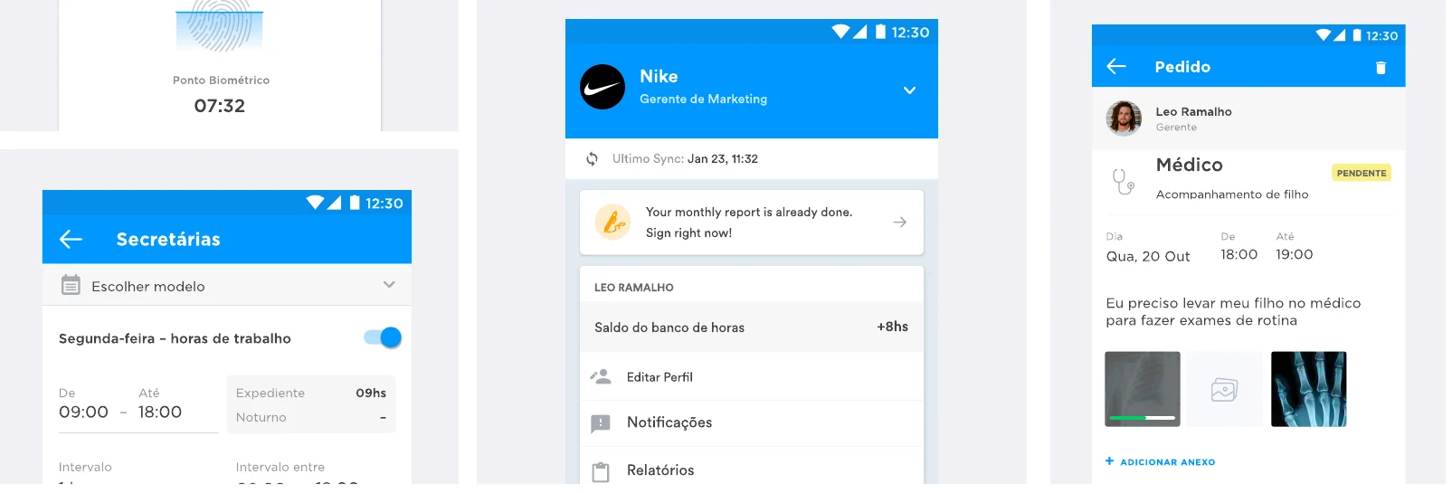
Activity details and requests extend the same experience, keeping the information people need close to the task.
Visual feedback
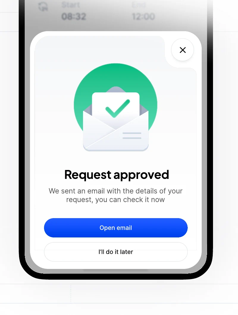
A little clarity goes a long way.
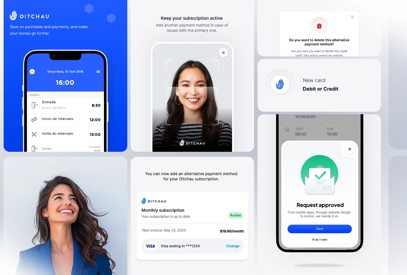
Purpose-built illustrations and explicit confirmation states help people understand what happened and what to do next, from a successful request to a recorded clock-in.
03 / The strategic dashboard
From more data to better decisions.
The dashboard needed to help leaders spot problems and act. The next challenge was turning a dense operational view into a useful, adaptable decision-making tool.
The initial challenge
Too much effort before the first useful insight.
A complex interface, information overload, and limited customization slowed adoption. A long time to value meant managers had to work too hard before the dashboard became useful.
The decision
Make room for each company's priorities.
User research and iterative testing informed a modular approach. Companies could tailor the dashboard to their needs, reducing cognitive load and making relevant information easier to find.
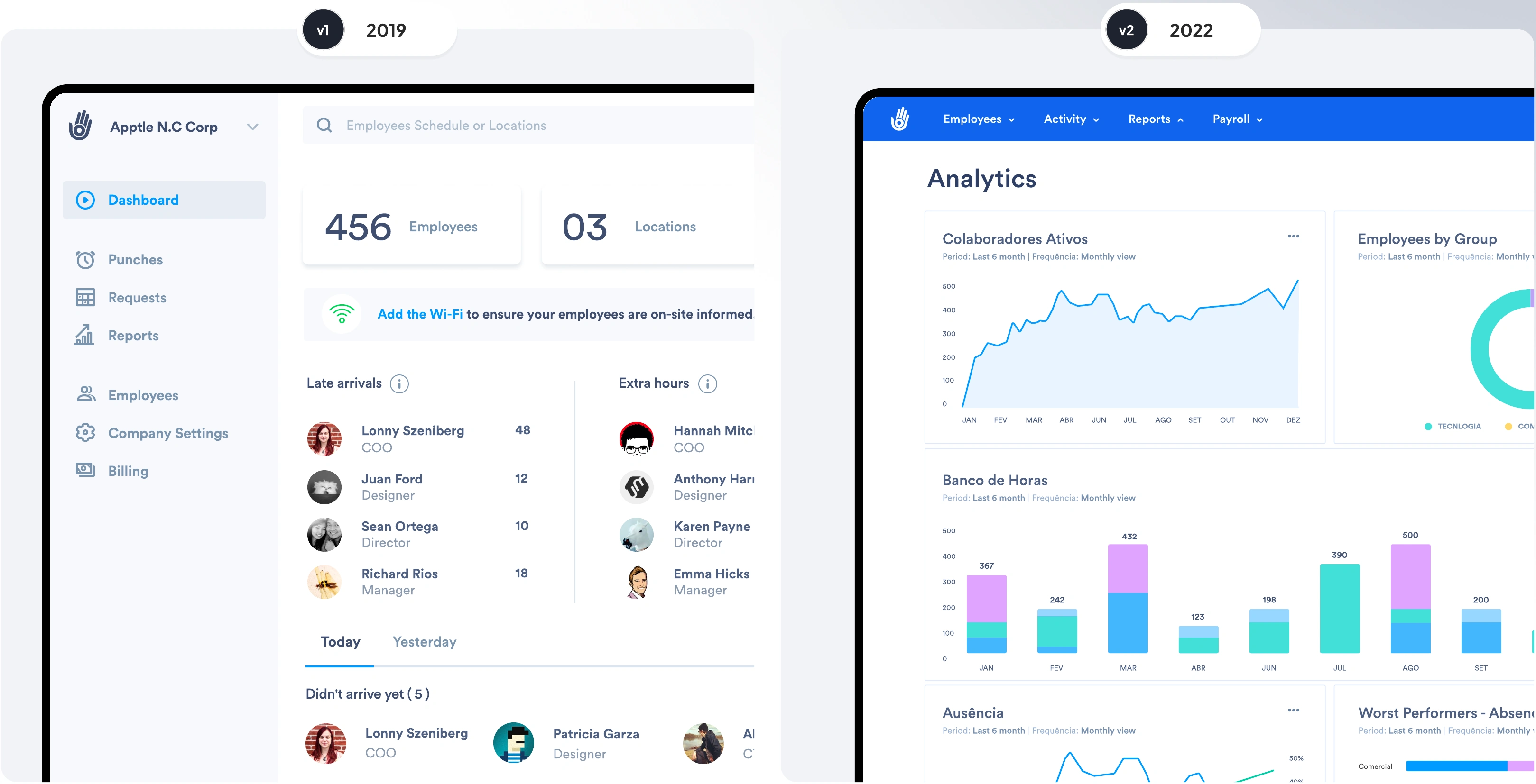
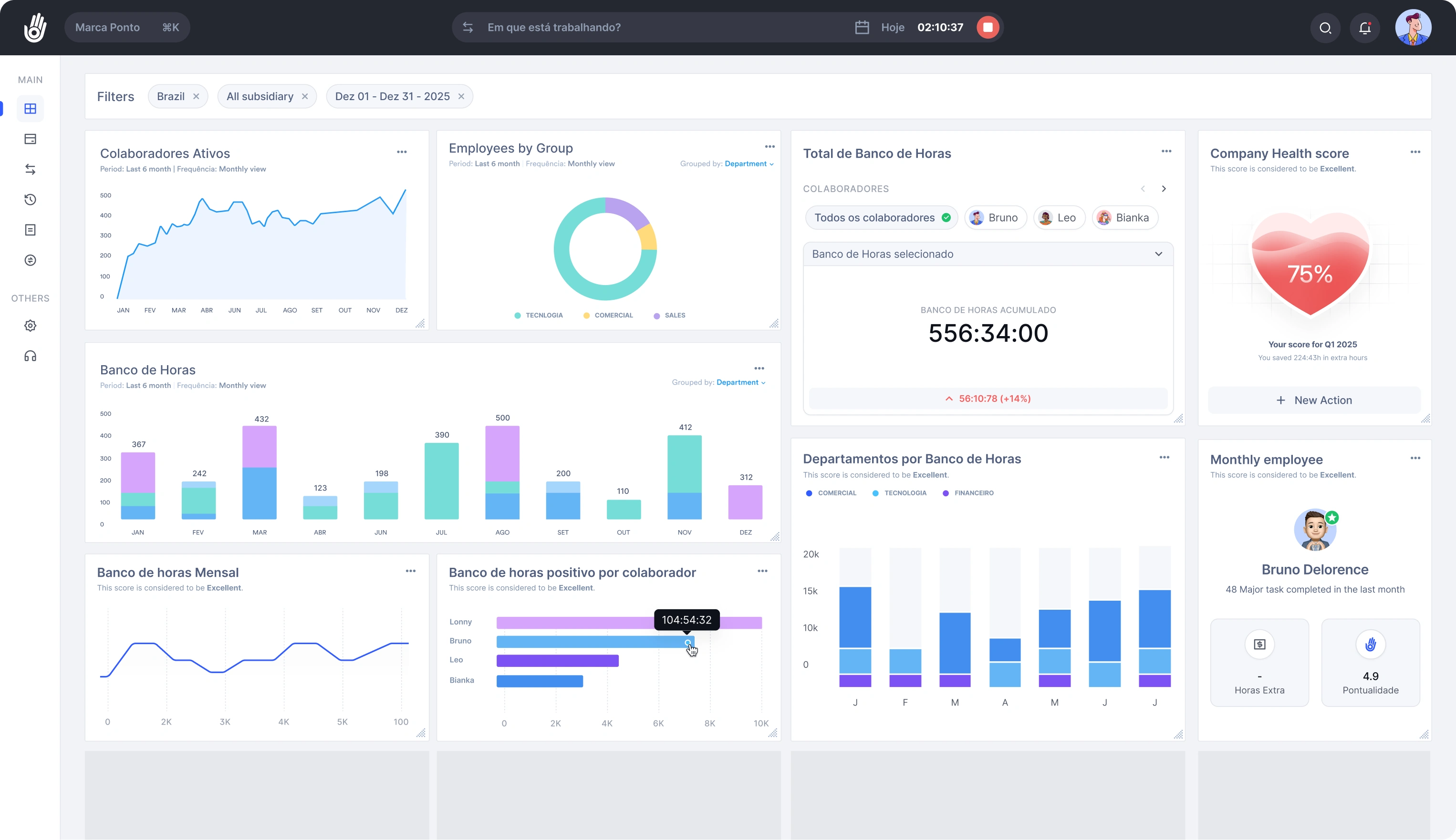
A modular system
A clearer view of the details that matter.
Time-bank totals, employee breakdowns, and department views form reusable modules. The interface supports both an overview and a closer look at an individual team or employee.








Further exploration
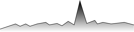
Helping managers spot what needs attention.
The presentation also explores AI-assisted analysis and anomaly detection: highlighting deviations so managers can investigate. These concepts extend the dashboard direction; they are shown separately from the reported results below.





The outcome
- 10 → 2 days
- Time to value
- +50%
- Dashboard retention
- Modular
- Schedule management tailored to each company
Outcomes reported in the project presentation, dashboard chapter (page 31).
The full story
Every screen starts
with a real problem.
Explore the complete process, interface studies, and results in the 31-page presentation.
Download the presentation Next project · Workbench ↗
Start a conversation
Let’s talk about your product, your team, and where design can create the most value.
- Call duration
- 20-30 minutes
- Topic
- UX Leader
- Price
- Free
